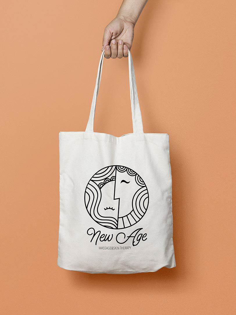
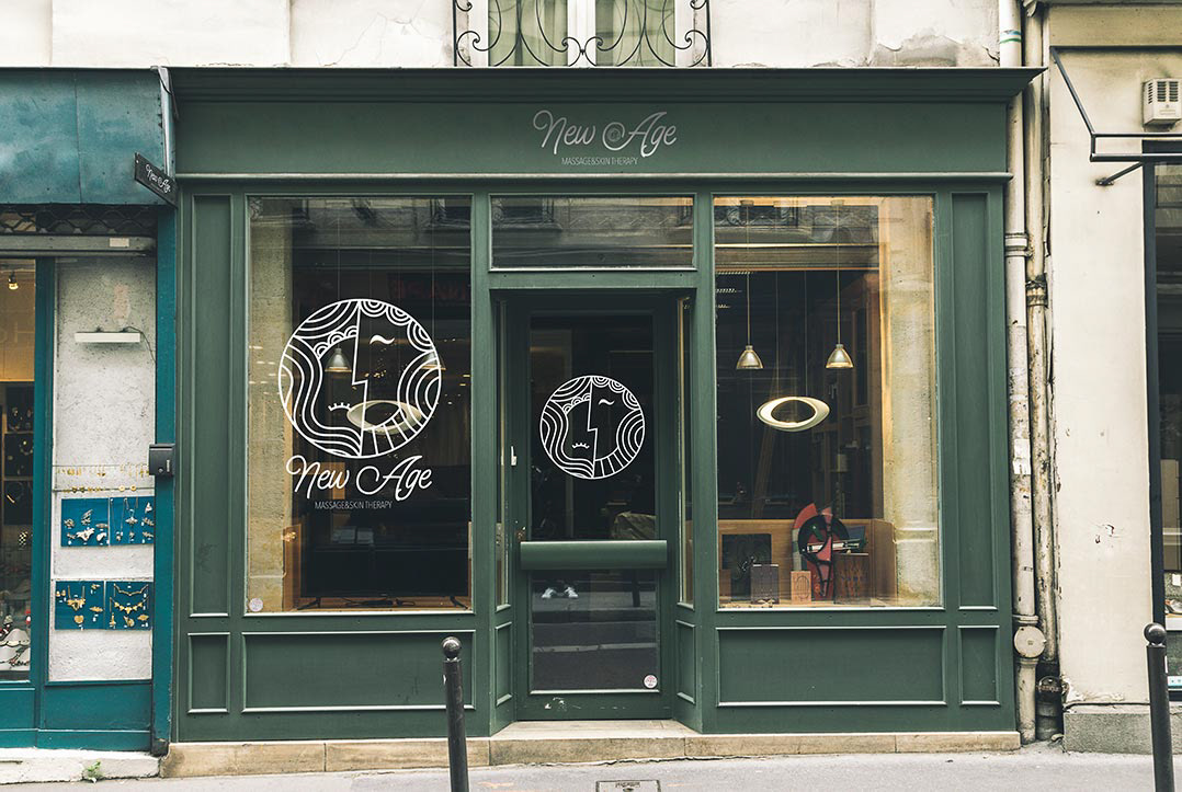
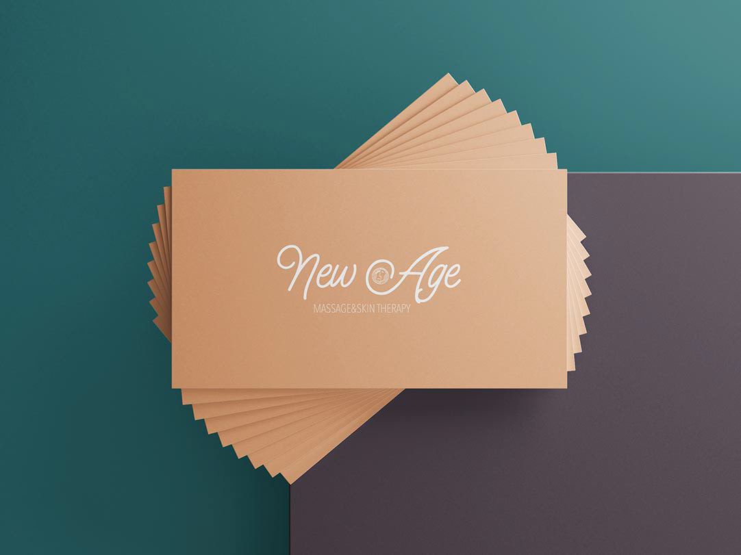
A logo and a basic colour palette designed for the massage parlour in Kraków, Poland. The client requested something that would stand out from all other masseuse's branding. It was essential to her that her logo look good both on a window and basic stationery.
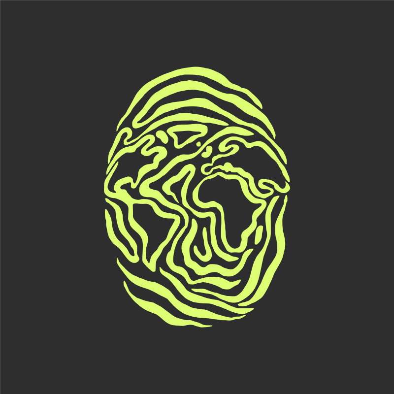
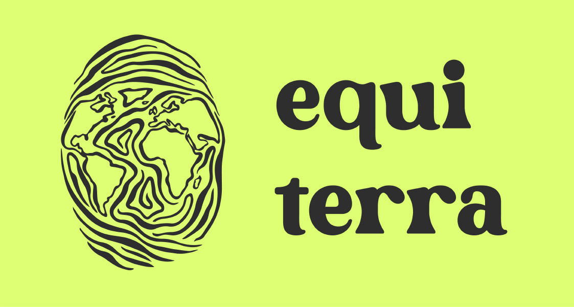
Equiterra is a brand created during the pandemic for our (my husband's and mine) ecological passion project. It contains two logos: a more detailed one and a simple thumbnail alternative. They both go well with the typography and the complementary energetic palette.

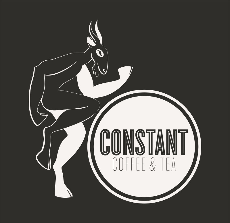

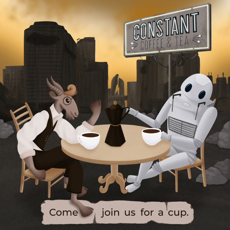
I got commissioned to add a dancing goat to the original Constant Coffee & Tea logo so it better represents the origins of coffee making. Apparently, the goats dancing after eating coffee beans brought Ethiopian shepherds' attention to the plant, which started the ancient coffee-drinking tradition. The goat I designed looks more like it's jazzing than jumping from the excess energy, but the client loved that vibe. So much, in fact, that he also requested an illustration with a similar goat and a coffee machine robot drinking fresh-brewed coffee in a post-apocalyptic setting.
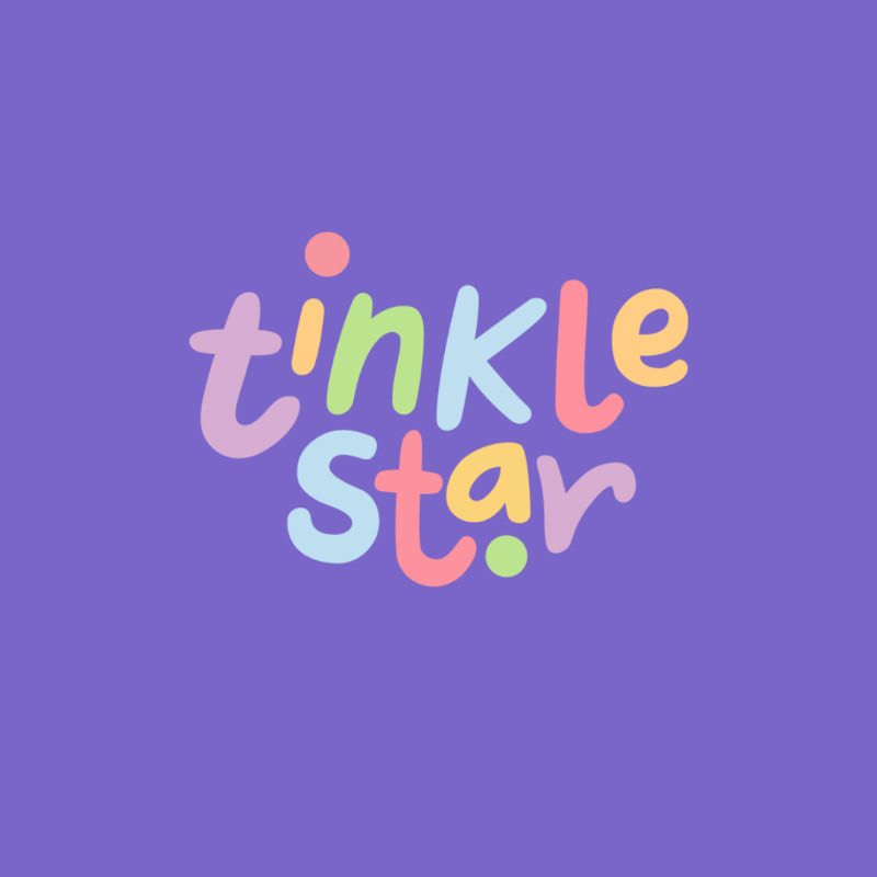
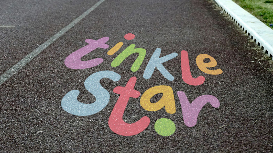
I created this colourful brand for an expat mother in Singapore who wanted to help other mothers spend more time with their kids outside. The style of the logo, the colour palette and all the additional elements of the Tinkle Star brand relate strongly to the aesthetics of kids' chalk drawings.

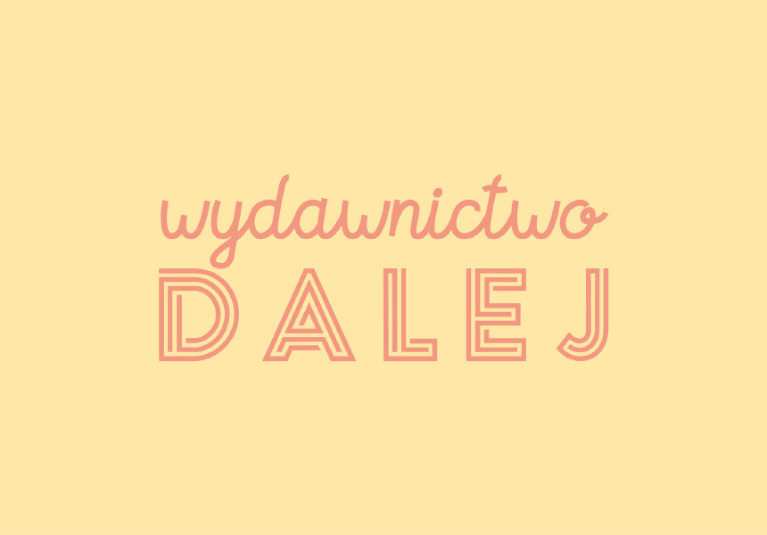
This is the logo I made for Wydawnictwo Dalej - an independent children's literature publishing house. The client came to me with her idea for the main font, so I took it and complemented it with supporting typography and a dreamy colour palette.
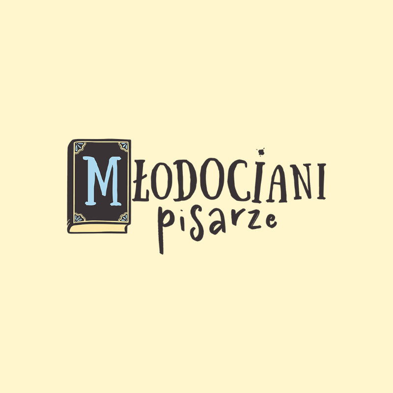
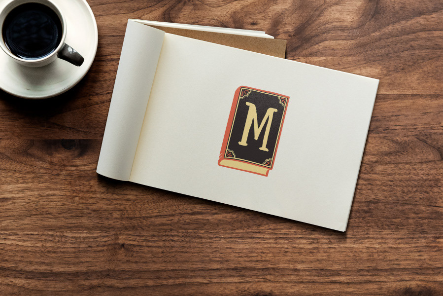
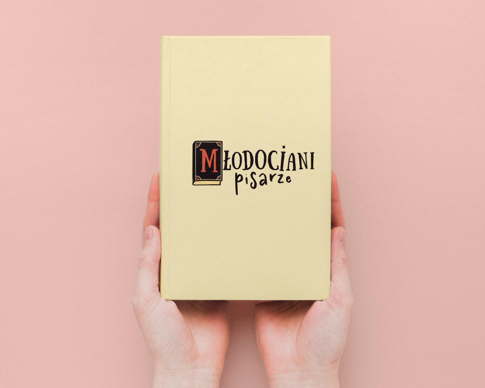
As a proper bookworm, I was happy to create a logo for the initiative that shares the love of books and reading among 9 to 12-year-old children. Młodociani Pisarze is a Polish literary competition for young authors organised since 2021.
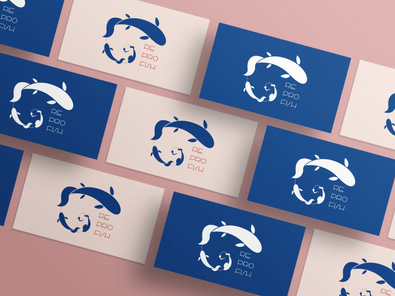
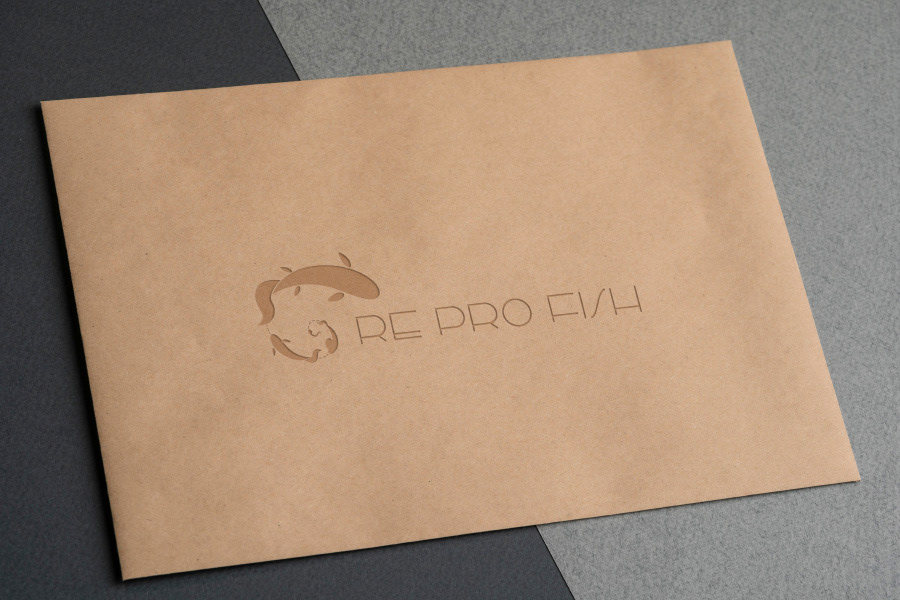
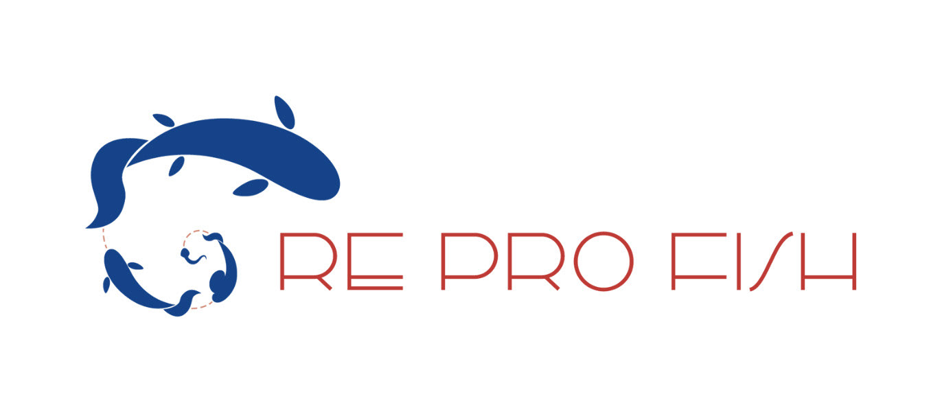
In 2021, I designed a logo for Re Pro Fish - a fish reproduction institute brand (functioning as a part of the Polish Academy of Sciences - PAN). I based it on the golden ratio proportions, which makes the reproduction cycle relate even more to its natural roots.
Julia is a talented dancer whom I had the pleasure to meet during Zumba classes that she had taught. But soon, as her heart started to belong to Samba Brasileña, she quickly became an instructor of this beautiful dance and created her brand around Brazilian samba events. I designed a logo for her that embodies the passion for samba and the colours of the Brazilian carnival.

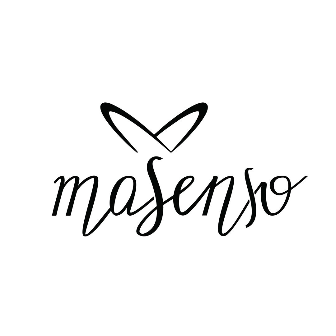
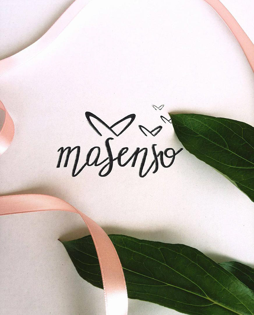
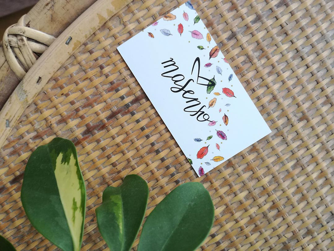
I created the Masenso brand for a Polish eco-fashion company. It was one of my first branding projects, and I'm still pretty proud of how it came out. Apart from the simple black and white logo, I designed a stamp and a business card for Masenso. Later, I was also contracted to create two surface pattern designs for their line of leggings.
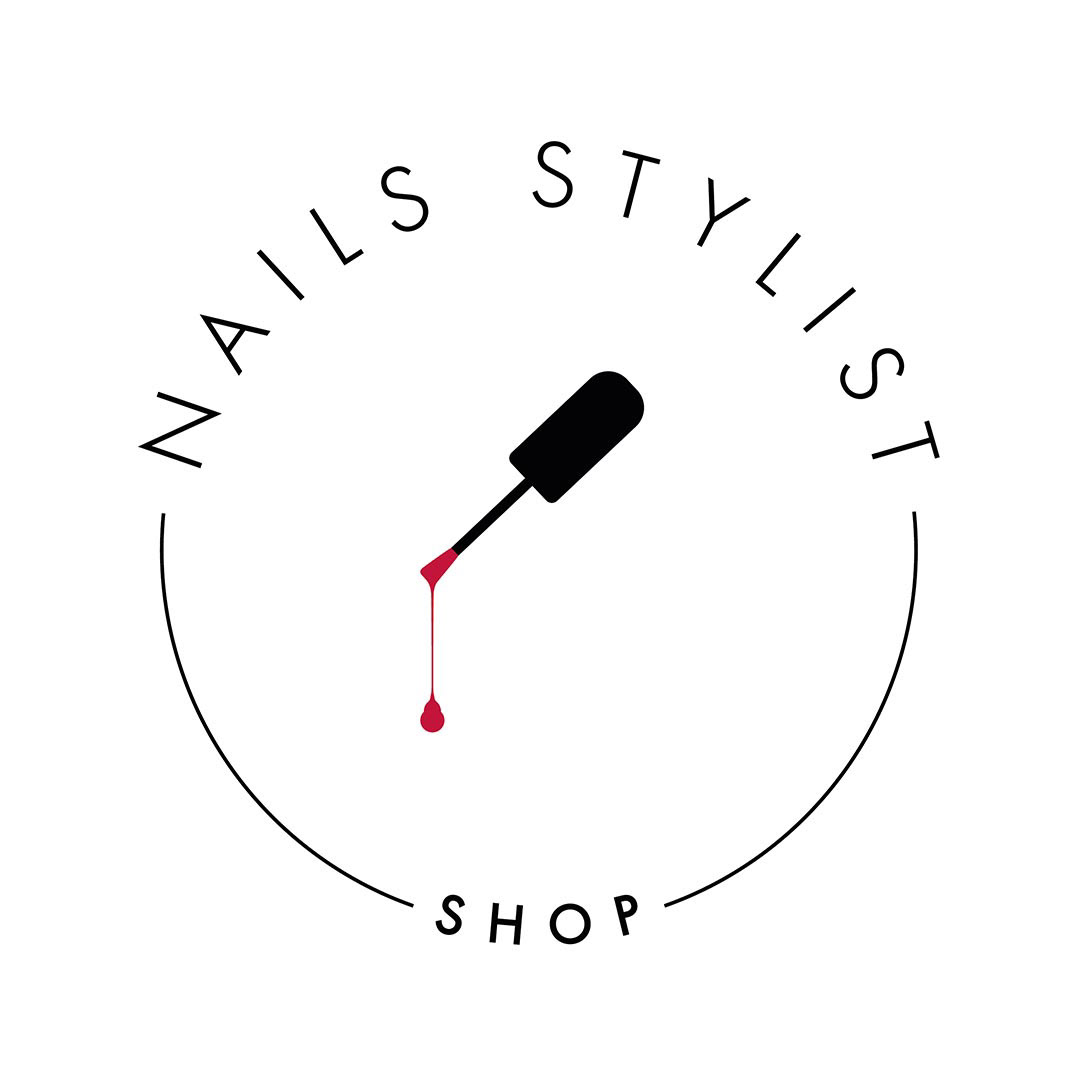
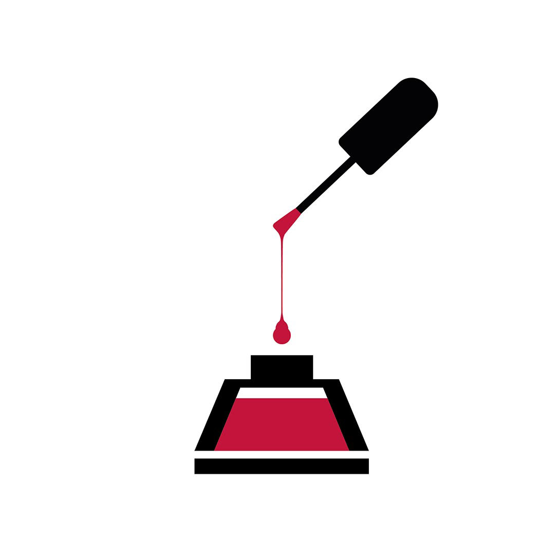
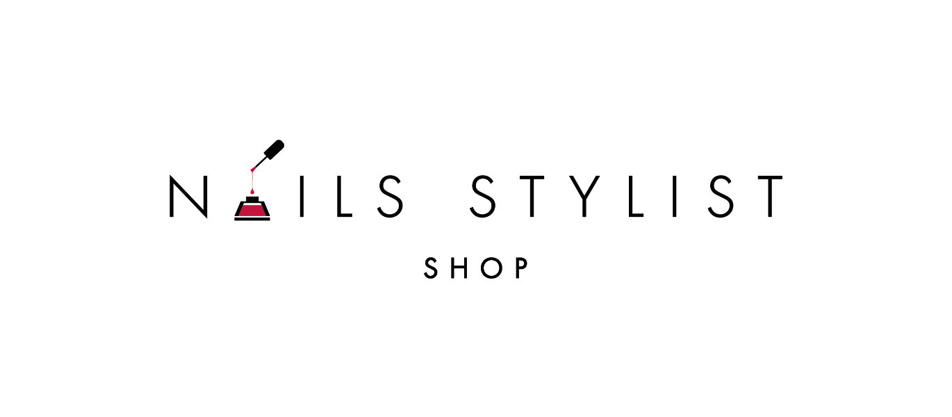
The beauty industry is packed with inspiring and original logos, so it is never easy to design a new one. But this logo I created for Nails Stylist Shop is minimalistic and easy to remember. I'm sure the client agrees because she was coming to me with her future projects after this one.
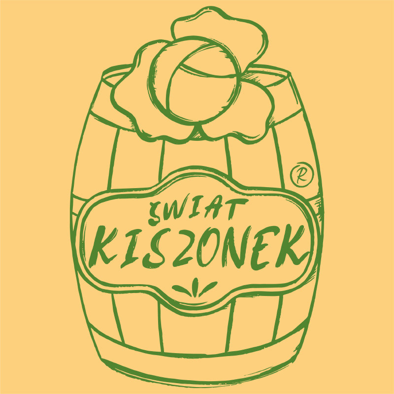
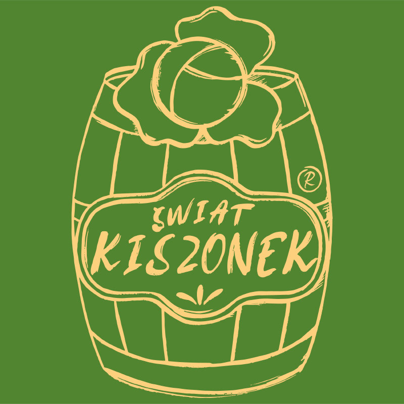
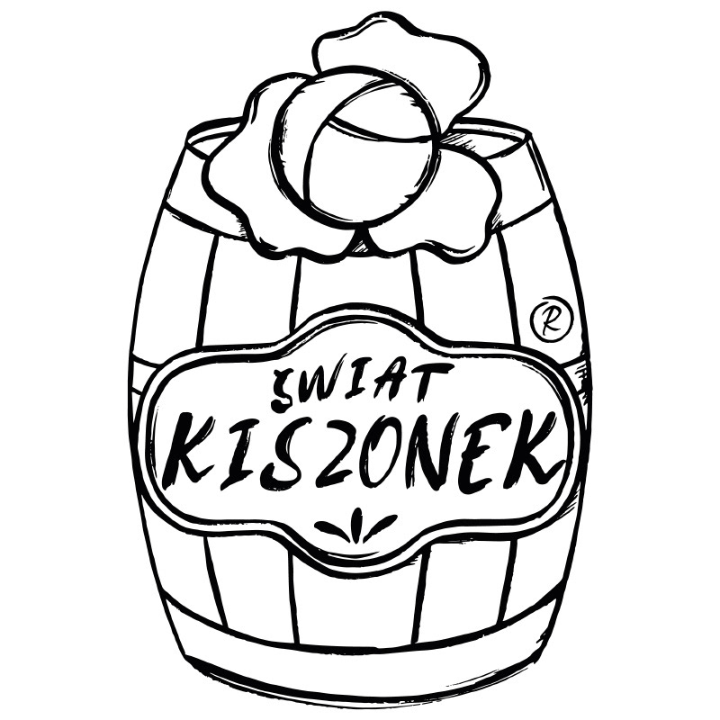
Świat Kiszonek was an unusual project for me, but interesting nonetheless. The brand focuses on classic Polish pickles such as pickled cucumbers and sauerkraut, so the branding had to scream "traditional". For this reason, I made the logo completely hand-drawn, including the trademark symbol ®, which I was asked to add later.
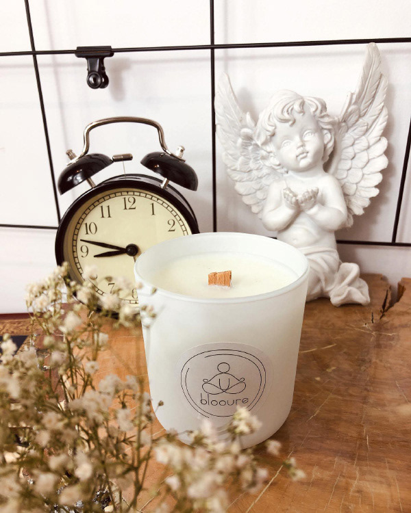
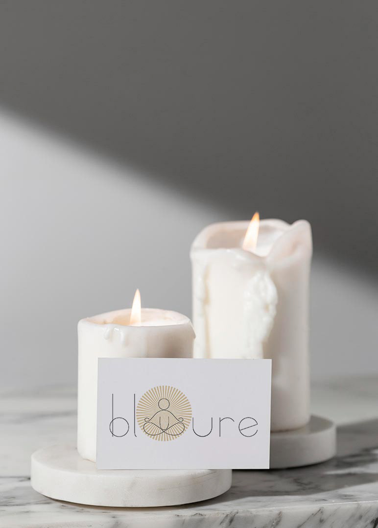
Blooure is a small natural candle factory, so their logo had to bring out feelings of cosiness and mindfulness. And all that while remaining delicate and feminine, like the two women who own it. That's why, including the owners in the creation process, I suggested a yogin for a symbol.
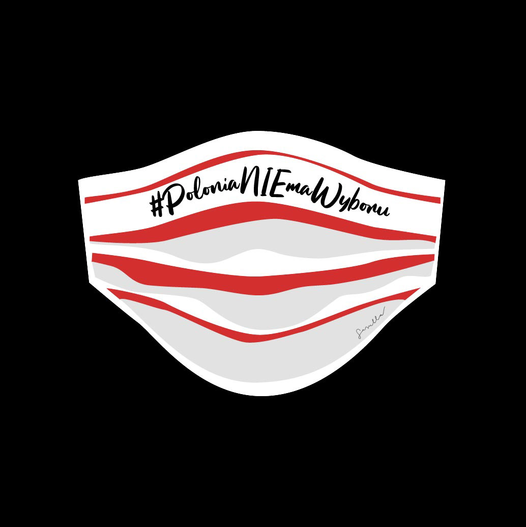
#PoloniaNIEmaWyboru was a social project co-created with fellow Polish immigrants in Spain. In 2020, in the middle of the world pandemic, the Polish government decided to hold a presidential election, which hugely excluded a lot of Polish expats. That unlawful voting came down in history as "the envelope election", which has cost the Polish government roughly 15 million euros (70 mln in local currency) and contradicted the principles of universality, secrecy and equality. Fun fact - this is the quickest logo I've ever made. It literally took me an hour and a half.
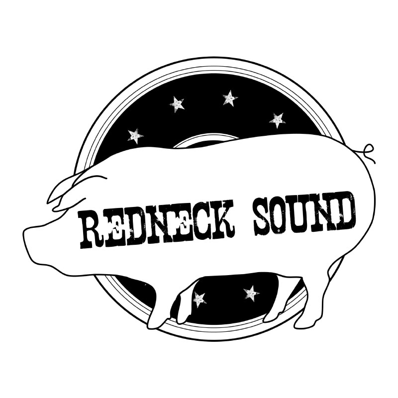
Redneck Sound is the first logo I ever made, and I'm proud to say it has served its purpose since 2016. That was the first time I was asked if I could do this and firmly responded: "Why, yes!" having close to no idea what I was doing. Who could've known it would start my graphic design career 😉
Over the years, I created several logos for myself. You can tell the logo quality grew along with my skills. But it also developed with my ever-changing taste and illustration style. The most current version has stayed in the same format since 2021. That's the longest any of my personal logos survived.
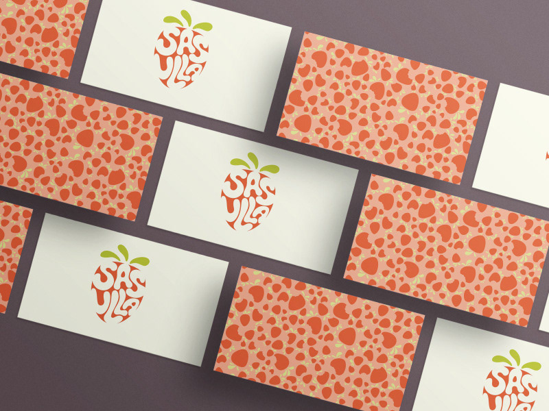
Some of my other logo projects: